Amazon Support Page
UX Design | UI Design | Academic Study
Finding problems and opportunities in amazon’s support page and design possible solutions for a more efficient support page.
Roles
Rafael Aguiar
Research, Experience design, Visual design, Prototyping
Deliverables
Final Layout, Style Guide, Prototype
Time
3 Weeks
Tools
Figma, Miro, Illustrator, Photoshop.
Project Overview
Description
Academic project for MID bootcamp from AELA, create a support page for amazon.co.uk in a way that support be done in more easy and efficiently for the users.
The focus off this study will be only in the desktop interface.
The Goal
Introduction
Amazon, one of the world’s most influential e-commerce and technology giants, has built its reputation on innovation, customer obsession, and seamless digital experiences. From its humble beginnings as an online bookstore in 1995 to becoming a global powerhouse spanning retail, cloud computing, AI, and logistics, Amazon has continuously evolved to meet customer needs.
At the heart of Amazon’s success lies customer obsession rather than competitor focus, ensuring that every interaction—whether shopping, streaming, or seeking assistance—is intuitive and efficient. This project focuses on one crucial yet often overlooked aspect of the Amazon ecosystem: it’s Support Page.
A well-structured support system is essential for customer satisfaction, reducing friction and frustration when issues arise. With millions of daily users, Amazon’s support page serves as a gateway to problem resolution, but how effective it is? This project will analyze its navigation, usability and efficiency, using competitor analysis and desk research to identify market trends, user pain points, opportunities for improvement. By refining the support experience, Amazon can reinforce its reputation as a truly customer-centric company, ensuring that even post-purchase interactions are as seamless as the shopping experience itself.

Amazon support page analysis
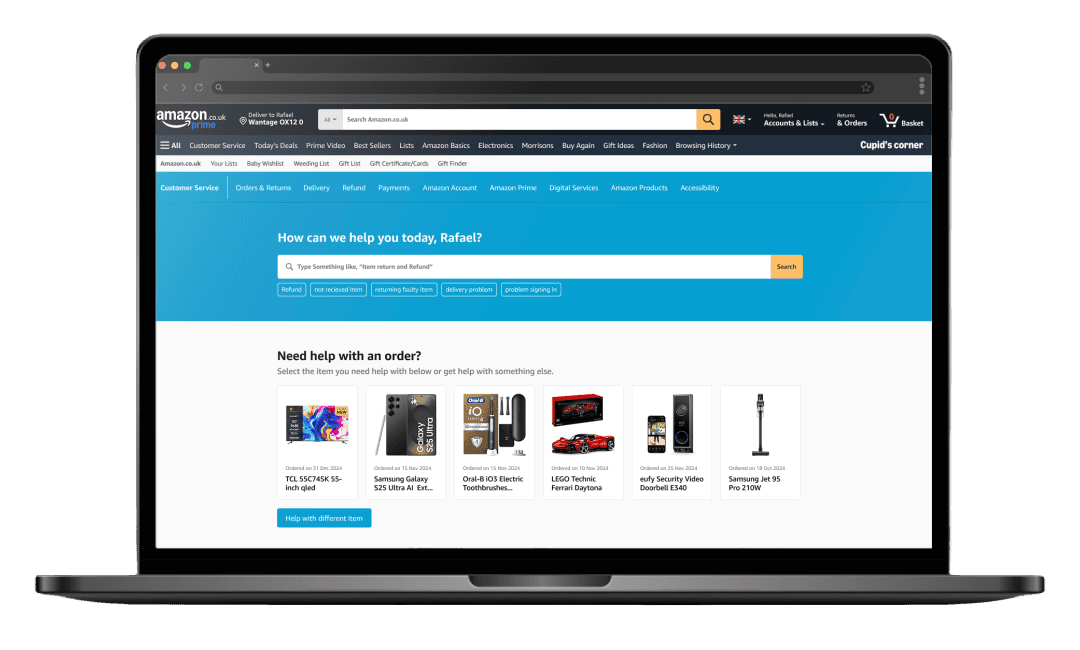
To further understand how the current amazon’s support page works, a usability and visual analysis was done. The analysis was divided in 4 main categories, Navigation/Structure, Visual design, Information/Content and Communication Channels. The main focus been in layout, readability, user experience, visual elements, information content and communication.

Navigation/Structure
The support page consists of two distinct sections: one with a dark blue background featuring visually appealing buttons with images and icons, and another with a lighter background that includes a search bar and a text-based grid of “All help topics.” The design inconsistency makes the sections feel like they belong to different companies, with the first being more user-friendly.
A dedicated customer service navigation bar is present but underutilized, containing only two links: “Home” and “Digital services and device support.”
The page offers personalized content by displaying the logged-in user’s name, creating a more welcoming experience. Additionally, a grid of quick-link buttons provides access to support pages for the user’s last six orders, offering relevant information and topics tailored to each order, making it easier to find order-specific support.
Visual Design
The first section with a dark background features a well-contrasted white CTA, making buttons easily identifiable. The iconography aligns with the brand guidelines and the overall website design.
However, the search bar is the smallest element on the page, making it less prominent. Additionally, the “All help topics” article buttons appear visually underwhelming, lacking emphasis.
Information/Content
The search bar overwhelms users with excessive information, failing to provide direct and simple results—even when using predictive search suggestions. For example, a query for “Amazon Prime refund” returned 1,544 results.
Personalized content adds a friendly tone, while the latest orders section in the front helps users quickly navigate order-related issues. Clear categorization, supported by relevant icons, enhances usability. However, the “All help topics” section falls short, presenting too much information and making it harder for users to identify relevant topics efficiently.
Communication channels
The support front page lacks direct communication channels. Options like chat, phone, or email only appear after users take specific actions, typically when they struggle to resolve issues on their own.
User research
To gain a deeper understanding of Amazon users, the digital intelligence platform similarweb.com was used to analyze web traffic, audience behavior and online performance. This analysis provided insights into user demographic, including age, gender, interests and what kind of device they used to access the website.
448,000,000 monthly visits
in the UK 🇬🇧
55.23%
Male
44.77%
Female
16.36%
18-24
27.8%
25-34
19.08%
35-44
16.52%
45-54
11.62%
55-64
65+
Age Distribution
53.51%
Mobile
46.49%
Desktop
Video Games
Electronics and Technology
Streaming platforms
Adult content
💡 These insights highlight the diverse profile of Amazon users, reflecting a techy-savy audience with a strong inclination toward digital entertainment, technology and e-commerce. By understating user demographic, device preference, and online, the study can focus on the core user base and identify key pain points in amazon’s customer service to discover problems and opportunities to better enhance its customer support page.
User complaints
Data was gathered from recent complaints, messages, and posts from social media platforms such as Facebook and X, as well as the latest reviews and complaints on Trustpilot.com. Notably Amazon.com or Amazon.co.uk does not respond to Trustpilot reviews, and no official account appears to manage inside the platform.

Compiling the data into affinity group, the most common problems identified among users were associated with deliveries, returns and refunds, and dissatisfaction with customer service, particularly regarding it’s inability to resolve their problems effectively,

The users also describe difficulty using the chatbot to solve return or refund of those deliveries problems, not finding helpful information from the support page, chat agent and bot responses not understanding their problem. Also users are having trouble solving the problem themselves through the support page and multiple times relies on a human being from the customer service to solve them.
The analysis reveals several critical pain points affecting amazon users with delivery problems being the most prominent. Complaints include stolen packages, non-deliveries, lost packages, item swap scam, missing items and insecure delivery location. Other mentioned pain points include problems and delays with the return and refund process and difficulty in gaining access to locked accounts.
User Pain Points
Delivery Scam
Users receiving “Junk” items in place of their order. Ex: Rock and old batteries taped together in place of a brand new smartphone.Delivery drivers scanning parcel as delivered and walking away with package.Slow response and refund by the support team.
Package missing/lost
Users having trouble in finding about their order through amazon support, getting no feedback from amazon delivery service. Users having no tracking update of order and having to request refund.
Packaged didn’t arrived
Users order showing delivery status as delivered, but no package received. Lack of support from customer service to solve the situation.
Stolen Items / Delivery on insecure locations
Users having parcels delivered on insecure location and having parcels stolen for not being at home at the time. Users struggle to request refund through amazon support.
These pain points, with dissatisfaction over the effectiveness of Amazon’s support page and customer service, highlights areas where users frequently encounter barriers. This data provides a clear understanding of the user difficulty with the current support process and sets the stage for further investigation into these recurring issues.
In addition to theses problems, an alarming scam was observed in Facebook groups in the comments section: customer service scammers impersonating Amazon support. These scammers approach users offering support and willing to solve the problem, requesting personal information such as names, addresses, bank details, order information via direct message. This deceptive behavior poses a significant risk to user data security and adds more frustration to the customer experience.
Persona
Based on the insights and demographic data gathered during the user research, a persona can be created using factual evidence. This persona serves as a representative model of the Amazon’s user base, offering insights about user behavior, goals, frustrations and expectations.

Benchmark
A benchmark study was conducted to identify best practices and trends utilized by leading e-commerce platforms in the British and global markets. The study focused on analyzing the support pages of three main competitors, evaluating their structure, navigation, communication channels, features, strengths, and weaknesses.

Trends and Similarities
Search-centric layout
Support pages prioritizing search functionality place the search bar as the primary element. For instance, Argos.co.uk incorporates a secondary search bar at the bottom of the page, ensuring users can search again if their initial read of the page does not locate their query.
Search bar - Predictive search
Predictive search functionality is a common feature, offering real-time suggestions as users type. For example, Ebay.co.uk enhances the user experience by including quick-action buttons and links to related articles directly while the user is still typing.
Communication Channels
A notable trend across competitor support pages is the inclusion of “Contact Us” information towards the bottom of the page. Communication options range from chatbots to live agents, phone numbers, and even physical mail. All these options are available to the user right in the home support page.
Amazon: Offers chatbot and live agent support, as well as a phone contact option. However, accessing these options requires navigating through a structured path of buttons and links.
Categories
All evaluated support pages organize help articles into categories, varying in granularity. While some platforms uses simple, high-level categories, others provide more detailed and specific categorizations.
User journey
For better understand step by step thoughts of the user, a user journey map was made. Knowing each step, discovering pain points and finding opportunities for a better experience
Scenario
John Green noticed his order was delivered but no package arrived at his house. Now he has to find a way to get information about his delivery, ask for refund or request new delivery of the same itens in his order.
Expectation
Obtain a solution for his order delivery issue.
Access to helpful and efficient customer support.
Clear online information.

Pain-points found:
No clear information what happened with his order.
Lack of visible contact information on the main page.
Chat: The pre defined response can feel rigid and unhelpful at times.
Chat: Questions asked by the bot repeats what the user already answered.
The process of reaching a human agent can be a bit tedious.
Expectation
Add option to chat with amazon’s bot in the front page to find solution faster.
If in the order page and asked to start a bot chat, skip the questions the user already answered through the interface.
For urgent queries, add option to skip the bot and talk with an human agent.
Known Problems
Users are having delivery issues with orders being missing, stolen and even not getting dispatched.
Users have trouble in solving their issues through support page relying on customer support agent.
Delivery drivers leaving customer package in insecure places.
Most of the complaints in social media and Trustpilot are related to delivery problems.
High value orders being delivered with wrong items inside. (Those wrong items being: cheap or trash items to mimic the weight and shape of the ordered item)
Not known: if it is a logistic problem in the warehouse, delivery drivers or seller issue.
Customer order package gone missing and no information given and long time waiting for refund.
Customers having difficulty speaking to a customer support agent.
Users having disaffection with amazon customer support agents.
Search bar underused and not effective. A search result can return more than 150 results.
Problem Statement
Amazon’s support page struggles to resolve users issues effectively, especially delivery-related problems such as packages being delivered on insecure locations, packages not arriving, packages stolen and wrong items being delivered. Users faces difficulties trying to resolve these issues by themselves leading to frustration and dissatisfaction.
Ideation
For the start of ideation process, opt for the How Might We (HMW) methodology, where by constructing how-might-we questions generates creative solutions while keeping focus on the right problems to solve. For generating the questions, used the problem statement as a compass of what problems and how might we solve them. Below is the compilation of the ideas:
How might we make the delivery problem solution information more visible to the user?
Add highlighted delivery problem section with link to a dedicated delivery order problem page.
How might we make support page more intuitive and effective for the user?
Categorized FAQ section.
Less information and more intuitive layout as seen in the benchmark study
More usable Nav bar with clear categorization based on topics:
Order / Delivery / Return and Refunds / Amazon prime / Scams / ordering / Account / Amazon digital device support / Other
Change location of search bar to be the first element, Increase the size and improve visually.
Better predictive search with real time article suggestions while typing.
Improve search results with better layout and grouping by topic.
How might we make the search results more intuitive, faster and easier to be read by the user?
Show results with subject category tags.
Reduce cognitive load by removing every Help Topic List.
Add filtering result by subject.
Centered layout following the rest of the support pages.
Add highlighted card with quick information relevant to the search.
How might we gather information and evidence of delivery of items in insecure locations?
In the order help page, add a delivery feedback button directing user to leave a delivery experience feedback .
How might we reduce the complaints in trustpilot and social media and increase trust and satisfaction?
Add complaint link directly on the support page, to gather data and feedback of users.
Proactive support team to solve and answer these problems as fast as possible.
Labels:
Support Page
Customer Support Team
These changes are expected to improve user’s understanding of the delivery process, provide another way to leave feedback of the deliveries, and offer a faster and more intuitive way to access the Amazon chatbot or live agent chat. Additionally, repositioning the search bar, improving predictive search capabilities, and refining how search results are shown may help users find solutions more quickly and efficiently.
Wireframe
Low fidelity

A low-fidelity wireframe was developed to establish the initial structure and layout of the support page home, search result and article. The wireframe was designed following the hypothesis gathered on the definition phase. The key elements were reorganized as follows:
Nav bar featuring quick links to key categories.
Search bar with suggestive messaging and quick search to enhance usability.
Section displaying direct links to assistance for the last six orders of the user.
Help section for delivery issues.
Simplified category navigation, prioritizing the main e-commerce categories and the rest hidden inside a “show more” button.
A categorized FAQ section utilizing tabs for improved categorization.
Link to amazon complaint form.
Medium fidelity

Features
Search Result
Change layout and how results are shown in the search results page, with results as main focus showing on the left and the support content on the right with distinctive categorization and the possibility of using filters, and quick solutions section.

Predictive Search
Better predictive search while user typing, showing articles and frequent asked questions.

Style Guide
For the style guide followed, will be using Amazon’s Brand Colors, Typography and visual language, following the rest of the website language with a more modern look.
Color Palette

Typography

Iconography

Final UI
A low-fidelity wireframe was developed to establish the initial structure and layout of the support page home, search result and article. The wireframe was designed following the hypothesis gathered on the definition phase. The key elements were reorganized as follows:


Prototype
Or access prototype on external link: Amazon Support Page - MID level 0
Next Steps
The proposed solution focus in effectives of problem resolution, especially delivery related problems, reducing friction in these problems solving while aligning with industry best practices and trends. While this project concludes at the prototype stage, the insights and designs recommendations provides a strong foundation for further development and real-world implementation. The next steps would be:
Responsive Design - Design the mobile responsive version.
Iterate based on feedback - Address any usability pain points found during testing, refining ui elements and interaction flows.
Collect Metrics - Gather metrics about resolution rates, interaction analytics and complaints
Technical feasibility assessment - Talk with developers to determine feasibility, implementation requirements and constraints.
User testing & Feedback – Conduct usability testing with a diverse set of users to gather insights and validade on navigation ease, search effectiveness, and chatbot interactions.
Stakeholder alignment - Present final prototype to stakeholders for validation and approval.
A/B Testing - Split website traffic for the new support page and the old, togenerate interaction and analytics data.